Blog

6 ways to improve the UX of your company's website

Providing a great user experience (UX) with your website is vital to running a successful eCommerce business. A good UX can boost your SEO, increase customer loyalty, and grow your sales, among other benefits!

In this article, we’re going to outline how you can improve the UX of your company’s website for the best results. Let’s get started.

Ensure your website is accessible so anyone can use it

You want to ensure that anyone who wants to use your website is easily able to, even if they require special accommodations. Not only is this a good business practice, but it is also often an Americans with Disabilities Act (ADA) requirement for eCommerce businesses.

Here are a few different steps you can take to make your website more accessible:

  • Add alt text to your images so they can be described by a screen reader

  • Transcribe your videos

  • Make your content accessible on all devices, such as both mobile and desktop

If you’re in the United States, your website may be subject to the regulations under the ADA. If you’re not sure where to begin, check out the ADA Compliance Website Checker from Siteimprove. They can help you identify accessibility issues and resolve them.

Make your checkout process quick and easy 

A poor checkout experience is one of the biggest reasons that shoppers abandon their carts. A Barilliance study found that having to create an account, encountering unexpected shipping costs, and finding a checkout process confusing were a few major reasons customers decided to abandon their carts. So, you’ll want to put some time and effort into ensuring this last step in the buying process doesn’t put your customers off. 

Here are a few tips for ensuring an easy and straightforward checkout process:

  • Use a single-page checkout

  • Don’t require mandatory account sign-ups

  • Make your forms quick and easy to fill out

  • Offer a service like Klarna that lets people pay through installments

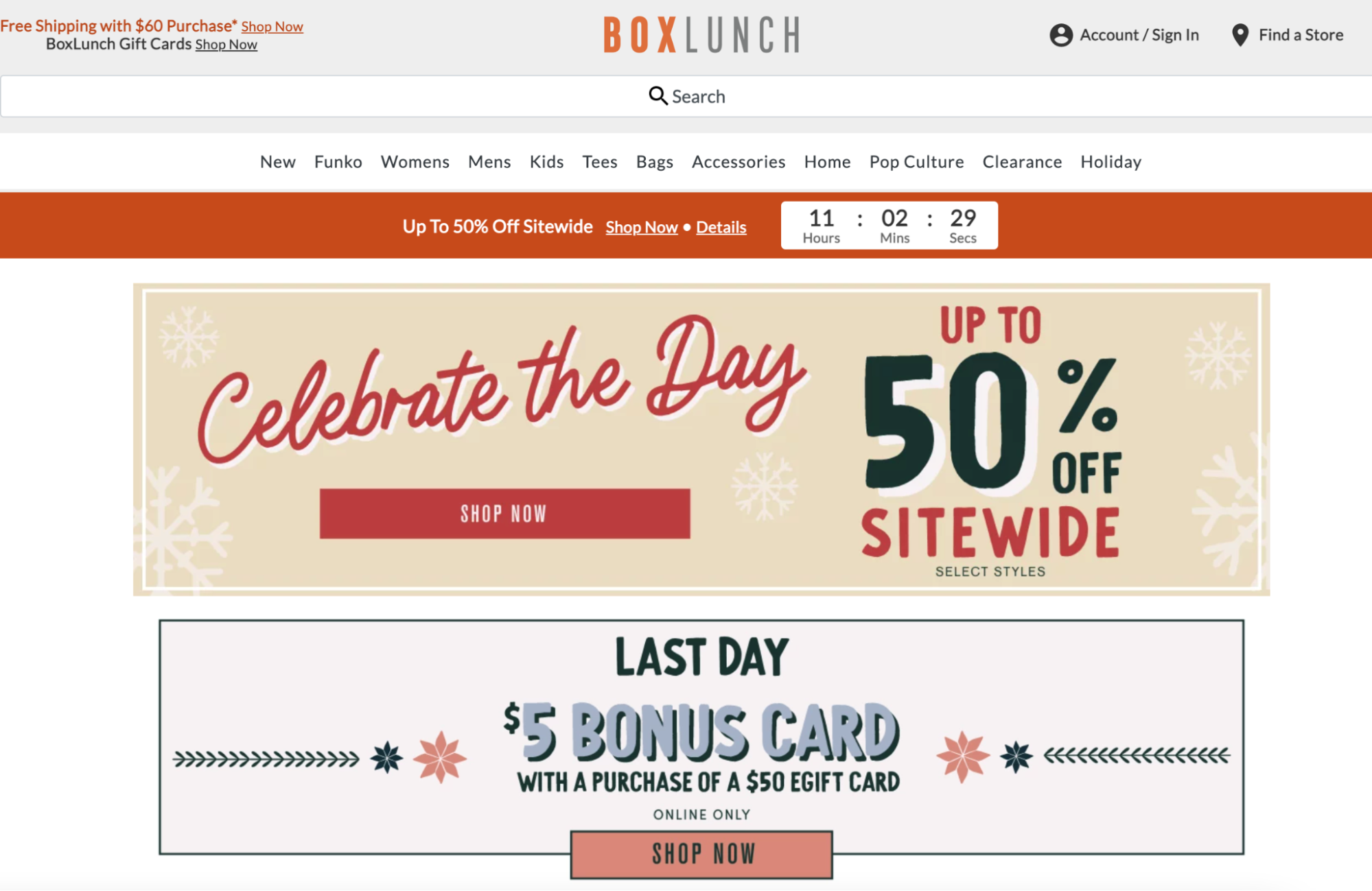
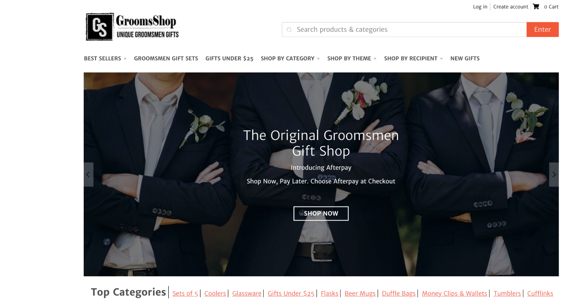
Let’s take a look at an example of a business that has a quick and easy checkout process for inspiration.


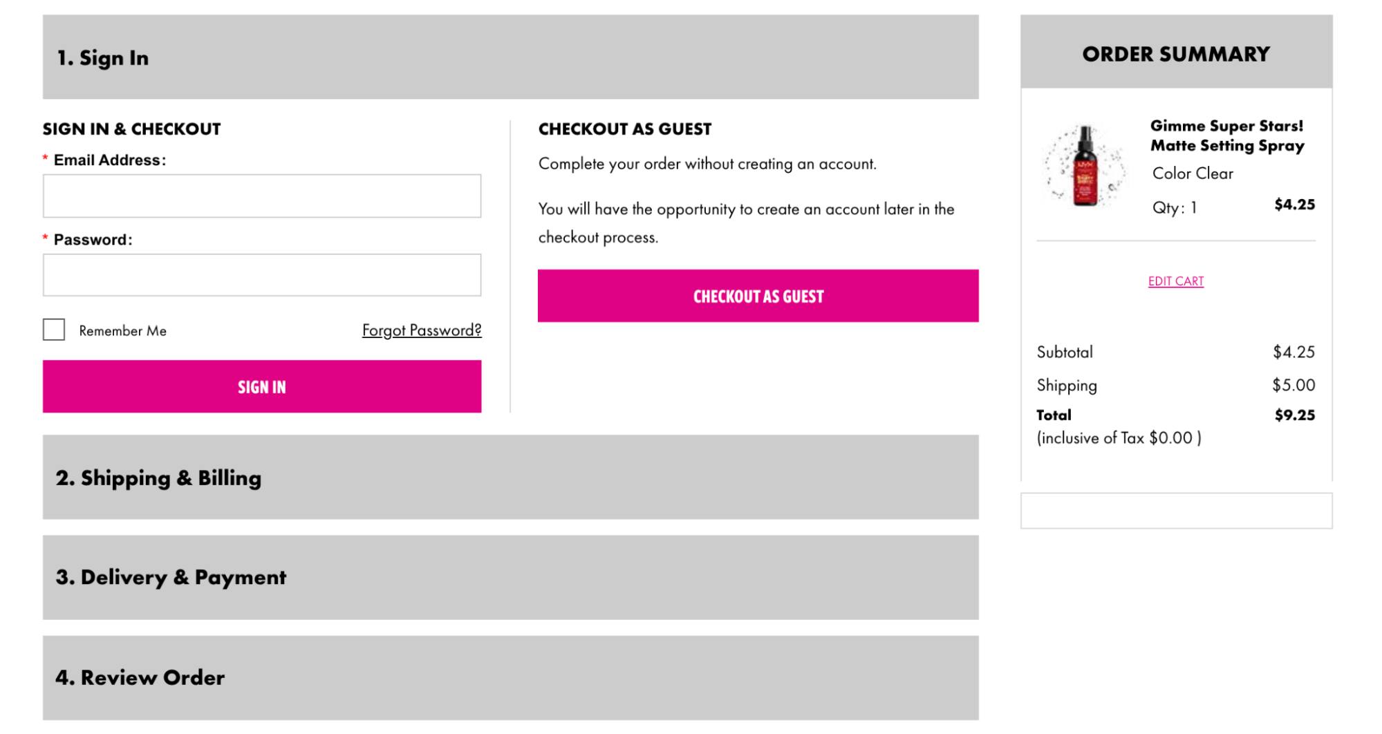
NYX, a cosmetics retailer, makes their checkout process very easy! As you can see in the image above, the entire process can be completed on a single page. Plus, a user doesn't have to create an account in order to make a purchase, and it’s clear how much longer the process is going to take. This gives a user a better idea of when their purchase will be completed so there’s no concern or confusion, which will help people to have a more enjoyable experience on the site. 

When setting up your own checkout process, take notes from NYX. Limit the number of pages the user will have to go through and be sure they don’t have to create an account in order to checkout. This will help to keep the process simple, improving your UX and reducing the risk of your customers abandoning their carts.

Publish content you know your audience needs 

Publishing content on your website’s blog is a great way to market your eCommerce business. It can help you promote your products, build loyalty with your customers, and draw in the best traffic for your business.

To determine what type of content your audience needs, start by checking in with your customer service team. See if there are any common questions or concerns they frequently get asked. If you base content on these questions, you can address common pain points without people having to get in touch with a service rep. 

Next, conduct some keyword research. Keywords are the words and phrases that people plug into search engines in order to find the products, services, or content they’re looking for. To find the right keywords, head to a tool like Google Keyword Planner and plug words and phrases related to your business into the tool. Google will then provide you with a list of keywords based on their competitiveness, or how hard they are to rank for, and their average monthly search volumes. 

Many of the keywords Google shows you will work as topics for content, or can simply help to give you some inspiration. If you weave these keywords into your content, not only are you more likely to rank higher on the SERPs, but you’ll also help to ensure that the content you produce is actually what your target audience wants, improving their experience of using your website.

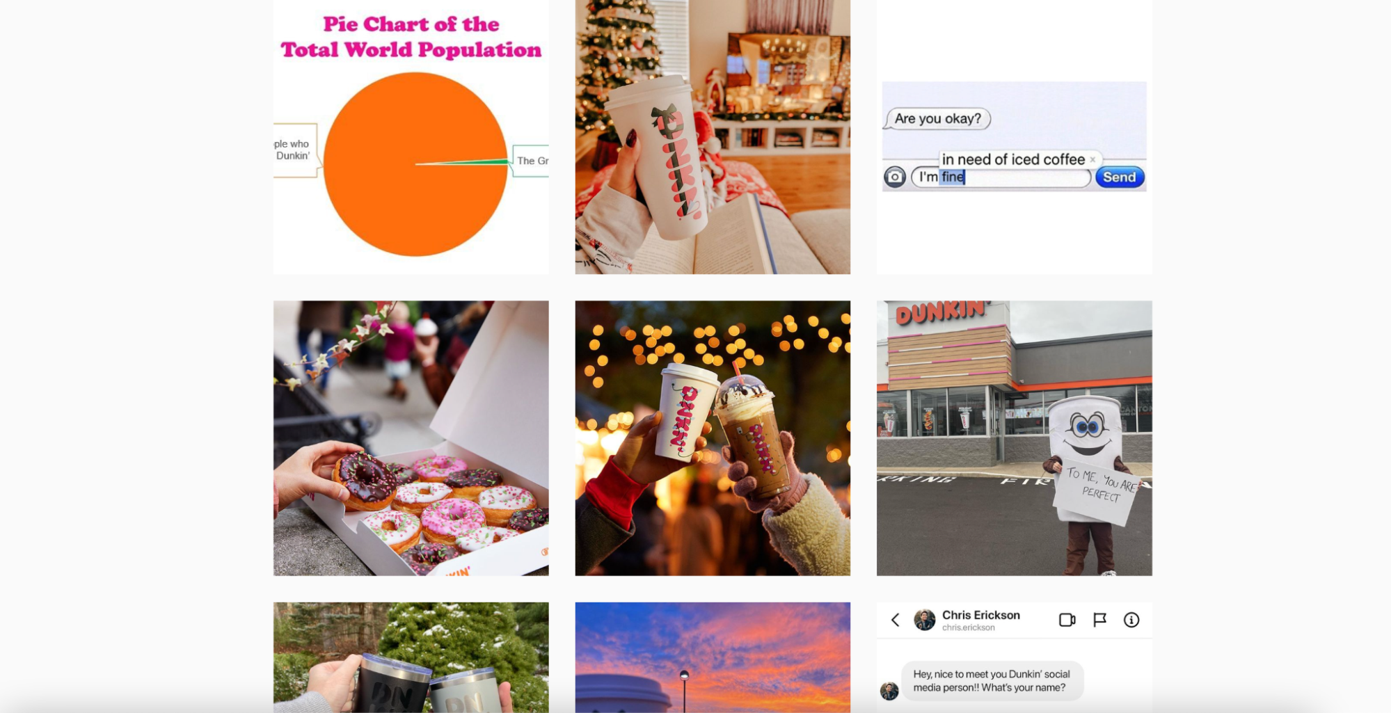
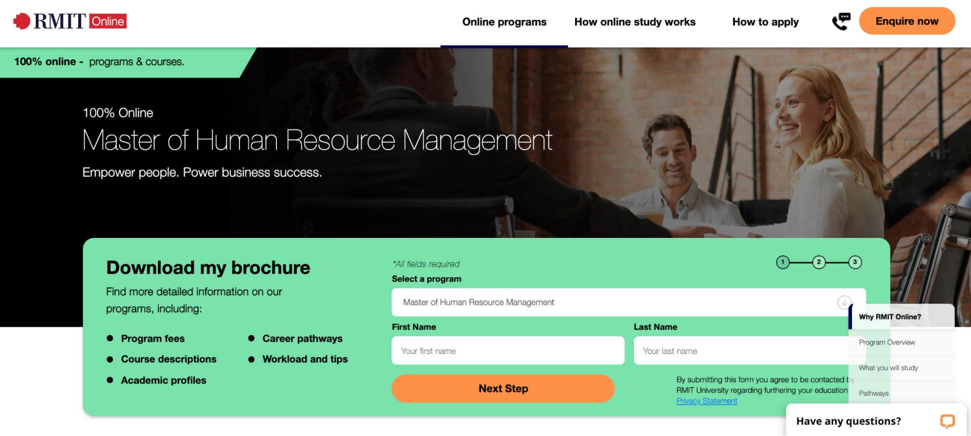
Let’s take a look at an example of a business that has great content on its website to get some inspiration.

Victoria University Online, a higher education institution in Australia, has great content on its website. As you can see in the image above, Victoria University Online has several articles outlining topics related to their different program offerings. They discuss why these fields are important, how their courses work, and more. By offering these articles, Victoria University Online can help prospective students make decisions about what they should study, improving their UX.

Consider offering articles about a wide range of topics related to your business on your website. Content like this can ensure that people have an enjoyable time on your website and improve your UX.

Optimize your website’s loading speed

No one wants to sit around and wait for a website to load. So, if someone finds your website to load too slowly, they’re likely to leave. Try to keep your page loading speed under two seconds — this will help you improve your website’s UX and increase your conversion rate.

Increasing your load speed can also help you rank higher on relevant search engine results pages. This is because Google only wants to send their users to the best websites possible. If someone comes to your website and quickly leaves because it was loading too slow, this will indicate to Google that your website isn’t useful to searchers. This can then have a detrimental impact on your rankings, which you don’t want. 

Here are a few different ways you can increase your page loading speed:

  • Optimize your images: Images can take up a lot of bandwidth, which might affect your site’s loading time. Reduce their file size using a tool like TinyPNG.

  • Remove dead links: This will help you avoid redirects, increasing your serving speed. 

  • Limit the number of plugins you use: Plugins like those for commenting and social sharing are often necessary, but be sure they aren’t overloading your website.

  • Enable browser caching: This allows the server to get files from the cache instead of re-downloading them over and over again from the network. This will increase your site’s loading speed.

If you’re struggling to identify how to keep your loading speed up, check out Google’s PageSpeed Insights. This tool can help you identify problems affecting your loading speed so you can fix them!

Provide an intuitive navigation menu 

It should be incredibly easy for website visitors to find exactly what they need on your eCommerce website. If they can’t, they’ll likely leave your website without making a purchase! This means that you need to work to provide an intuitive navigation menu in order to improve your website’s UX and increase your sales.

There are a number of ways you can help people navigate your website. You could have categories broken down by the type of product, the type of person the user is (for instance, a student or teacher), or the type of problem the user is having.

Let’s take a look at an example of a business that has an intuitive navigation menu for inspiration.

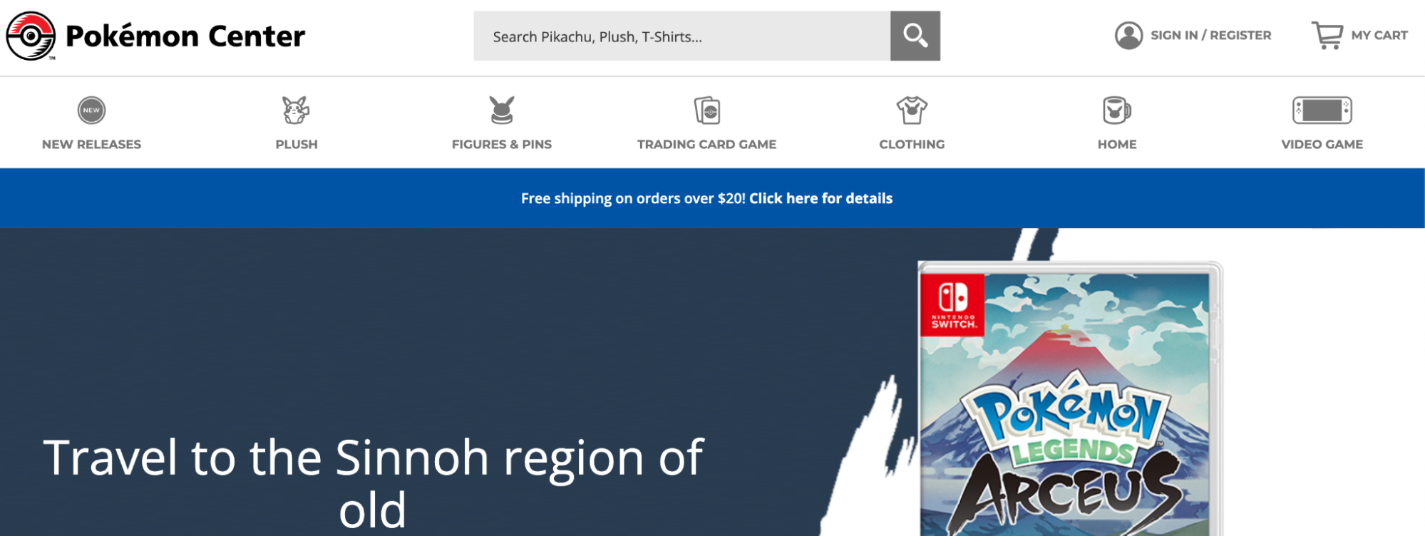
The Pokemon Center, the official retailer of all Pokemon games and merchandise, has a very intuitive interface on their website. As you can see above, their products are divided into categories like plush, figures, games, and clothing. Because this company sells a huge amount of merchandise, this is a very effective strategy. Anyone who is looking for Pokemon products — from games to clothes — can quickly and easily find what they need. This helps The Pokemon Center improve their UX.

Consider dividing your menu up with different product categories. If you sell a wide variety of products, this will really help your website visitors to find what they’re looking for quickly and easily, improving your UX and helping to increase your sales.

Make it very easy for people to convert 

When people land on your website, you want it to be as easy as possible for them to take the next step with your business. This will increase your chances of making a sale! 

Additionally, making it easy to convert is an important step in improving the UX of your website. People value their time, and they won’t want to take a while clicking around your website in order to spend their money. If converting is straightforward, people will be more likely to follow through. 

You can help to make it easy for people to convert in a few different ways. Here are some examples:

  • Offer a clear and straightforward call to action, or CTA

  • Provide a sophisticated search feature that helps people to find what they’re looking for

  • Make it easy for people to get in touch with you if they have questions or concerns

For inspiration, let’s take a look at a few examples of businesses that make it easy for people to convert on their websites.

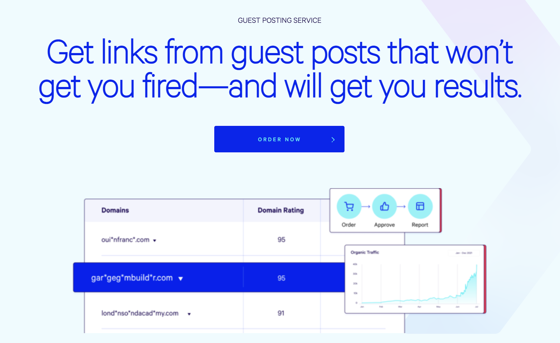
At Loganix, we make it very easy for prospective customers to get started! On our guest posting service page, we have several clear CTAs that make it easy for people to order our services. As the user scrolls down the page, they can also learn more about these services. We outline what we do, how our services work, and how we ensure quality control. It’s a straightforward page that offers all of the most important information without a website visitor having to click around too much. And, with CTAs throughout, it’s always easy for a user to get started. This creates a great UX that ensures it’s easy to make a purchase.

To improve your own website’s UX, offer multiple CTAs throughout your selling pages. Giving people several convenient places where they can get started with your business will let you target different types of people with different needs, making any one of them more likely to click. This will encourage them to make a purchase!

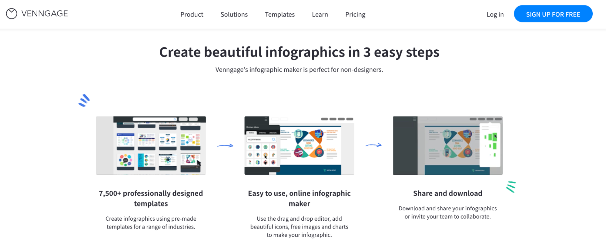
Finally, Venngage, an online infographic maker, makes it very easy for website visitors to convert on their website, too. As you can see in the image above, they outline how their services work, and then have several CTAs that say “Sign Up For Free.” This makes it very clear to the customer what they need to do next, and the CTAs make it easy for users to get started. By offering multiple CTAs and noting that they have free options, Venngage can improve the UX for their customers. 

Be sure that your service and product pages outline how your business works, and add CTAs throughout. If you do this, it will be very clear to users how they can get started, making for a great UX! 

Summary

Improving your website’s UX is very important to your overall success! In this article, we outlined how you can improve your UX with great content, a fast loading speed, an intuitive navigation menu, and more.

How can you use emotional marketing to make more sales?

It’s getting harder and harder to market products and services because the landscape is getting more and more competitive. With so many options facing your target audience, how can you ensure they choose your product or service? 

When using a combined marketing approach for your business, one of the best tactics you can use is emotional marketing. If you can build an emotional connection with your audience, you’re going to be more likely to secure their purchases. 

But what is emotional marketing and how can you ensure you target the correct emotions when trying to make a sale? Let’s take a look at everything you need to know to employ this marketing tactic to increase conversions and drive sales. 

What exactly is emotional marketing?

When building an eCommerce site, it can be hard to forge connections through a screen. But emotional marketing can help. It’s the intentional use of persuasive marketing messages that aim to connect with your customers’ feelings. 

It can help to form a deep, meaningful connection with your target audience to achieve the desired result, which is typically making a sale. 

With this marketing technique, you can target any human emotion, such as joy, fear, or even anger. Because human emotion tends to linger, emotional marketing is super effective for making sales. Here are some reasons why it’s so effective: 

  • You will earn more customer loyalty

  • You will create brand advocates for your products and services

  • Your content will be more shareable

  • Your brand will become more memorable

  • Your marketing will influence customer purchasing choices

So, how can you use this marketing technique to get results and make more sales through your eCommerce site? Keep reading to find out. 

Inspire a feeling of FOMO by creating a sense of urgency 

Inspiring the fear of missing out, or FOMO, is a marketing tactic that every eCommerce business should be using. It’s stirred up when someone feels like they are missing out by not being in a specific place or having a particular item. 

This is a powerful motivator because it drives emotions that lead to sales. People who feel they are missing out on a critical experience are more likely to purchase, so they feel included. 

Here is an example of this in action from the online retailer BoxLunch. Notice how their sale has a countdown clock, showing when their deals will expire. This creates a sense of urgency among their customers, who will feel they need to act quickly to benefit from this special discount. 

When trying to instill a sense of FOMO in your customers through your site, use language that makes it clear the discount or item will only be available for a short time. Creating a sense of urgency is one of the best ways to generate emotion in a potential customer and drive them to complete a purchase on your site there and then. So, be sure to keep this in mind when designing your site if you’re looking to generate more sales. 

Use imagery that will make your audience feel something

Your website imagery can be a powerful tool for helping your ideal customers feel something. This will help to build a connection between them and your brand and lead your visitors to purchase from your business, which will increase your conversions

You can use imagery that inspires both positive and negative emotions. Here are some examples of how images can spark emotions for your users:

  • An image of a helpful member of staff can help them feel relieved.

  • A photo of a problem — such as a spilled glass of wine on a white carpet or a damaged property — will remind them of their everyday stresses.

  • A photo of a happy child playing with a new toy will get their parents excited.

  • An image of a group of people enjoying themselves will make them want to be included in the fun. 

Depending on the products or services you offer, you’ll want to choose imagery that inspires the right emotions. For example, if your service is meant to take the stress out of a task, you’ll want your pictures to reflect a calm, cool, and collected tone. 

For inspiration, take a look at this example from the background search tool Intelius. Notice how they have used an image of people who have presumably just been reunited through the company’s services. This is an excellent choice of imagery, especially since their primary goal is to get users to use their background search services. 

Notice how the image is bright, and all the people pictured are smiling. The emotions conveyed are clearly joy and relief. You can use the same design strategy when building your pages by including images that show the positive results of your products or services. 

On the other hand, Highest Cash Offer takes a different approach. Since they buy homes in any condition, they have chosen to use an image of a damaged wall on one of their relevant web pages. This is sure to inspire fear and anxiety, but also relief, in their customers, especially if they own a home and know that, at any moment, a costly repair may be in order. 

Remember that emotional marketing is about choosing the right persuasive imagery based on what your business is trying to help your customers achieve. When selecting images for your site, first figure out what emotion you’d like to encourage. You need to choose the feeling that will make people realize they need your products or services right away. 

Once you’ve identified the target emotion, look for images that evoke it. You could even consider running some A/B testing with different ideas to see which one inspires the strongest and most helpful emotion in your customers. 

Help your customers to feel understood with useful content 

Most of all, customers just want to feel understood. So, if you can create content that answers their questions and addresses their pain points, you can show that you know what they need and how to solve their problems. 

To optimize your website so your customers feel understood, you’ll first need to know what questions and pain points they have. The best way to identify these is to ask your audience directly. Consider sending out a survey or creating a social media poll asking if your audience has any questions or concerns they’d like you to address. 

You could also ask your customer support team for ideas. Since they spend all day talking with your customers, they can give you a critical insight into what questions they hear over and over again. 

For inspiration, look at this example of helpful content from Insurance Navy, an insurance provider that aims to find its customers the most suitable coverage. Their blog contains many articles that answer common questions about SR22 insurance, which is a topic that many customers might not know much about before reading. 

Insurance Navy does a great job of educating their readers about SR22 insurance in a natural and easy-to-read manner. You can apply the same strategy to your content by identifying topics that your audience might not understand in your industry and then build educational content to help establish your business as a go-to source of valuable information. This will show that you completely understand your customers’ needs or concerns and can help them to solve whatever problems they’re experiencing. 

Another great example comes from Musician Authority. Since this site aims to support up-and-coming musicians in nurturing their talents, they hit it out of the park with their content that covers everything from how to start playing an instrument to the steps needed to start a new band. Since their target audience is beginner musicians, they tailor their content to meet their needs. The titles are straightforward and reference terms like “beginners” to show that they support musicians at the start of their musical journey. 

Musician Authority does a great job of connecting with their audience by building content that addresses the needs of their readers at all stages of a musician’s journey. You can apply the same strategy by thinking about what matters to your audience and then creating high-quality content to answer questions and provide guidance for them along the way.

As you fine-tune your content strategy, make it your goal to meet the needs of your target audience. Go above and beyond to offer relevant and meaningful content that will address their pain points and questions. 

This will go a long way towards making your customers feel understood and building trust in your brand, driving conversions and boosting sales. 

Make customers feel welcome with images of people who reflect them 

If you can help your ideal customers imagine themselves using your products or services, they’ll aspire to buy them. Plus, you can take steps to make your customers feel welcome on your website so they know that your products or services are definitely for them. 

One of the most effective ways to ensure all this is with images of people who represent your target audience. This means using images that reflect your target customers’ backgrounds and ideals. 

Using imagery that reflects your target audience is extremely powerful because it helps your customers see themselves using your products or services. It also shows that your company is meant for them, which will inspire purchases. 

A company that does this well is GroomsShop, an online gift shop for groomsmen. The banner image at the top of the company’s homepage shows a groom flanked by his groomsmen, reflecting their target customers. 

By using images of groomsmen on the big day, GroomsShop demonstrates that their products are perfect for a groom’s wedding day needs. You can use the same design strategy for your site by using images that speak directly to your target audience to create a powerful bond and quickly connect with prospective customers.

Choose imagery for your site that represents your customers and what you hope they achieve with your products or services. Ensure the images maintain the tone of your site and reflect a diverse customer population. The clearer a visitor can see themselves reflected in your site, the more likely they will be to convert. 

Earn website visitors’ trust with user-generated content

If you want your ideal customers to shop with you, you need to earn their trust. One of the most effective ways to do this is with user-generated content that shows people just like them have had positive experiences when shopping with your business. 

Your social media platforms offer a great place to generate and locate user-generated content. Simply offer incentives or run contests that prompt past customers to share their experiences online. 

Of course, you’ll need to devise an acceptable use policy that outlines how your company will use images on your site and on your social media accounts. This policy is important because it protects your business, and you should share it with your followers if you want to use their images in your marketing campaigns. But, once you have their permission, you’ll have an endless supply of marketing materials at your fingertips. 

The coffee and donut chain Dunkin’ Donuts has a user-generated content campaign that demonstrates just how lucrative this marketing technique can be. They use a unique hashtag to encourage their audience to tag photos that feature their products. Dunkin’ Donuts then posts the images on their website and Instagram feed to evoke emotions from their followers. This tactic emphasizes how their products bring families and friends together throughout the year and during holidays like Christmas. 


Notice how these user-generated images all have a soothing feel to them. The people in the pictures also showcase their Dunkin’ Donuts while at home or out on the town. This is an excellent strategy for showing potential customers that there are real people out there who are enjoying the company’s products. 

Take inspiration from the brand and use social media to market your online store. Your existing customers have the power to market your brand for you, too. So, engage your audience by encouraging them to show you how they use your product or service. 

Once you obtain permission, you can even use the images that inspire the right emotional reaction. Remember to thank your users and give them a shout-out for their unique content and support. 

Summary

Emotional marketing can be tricky at first, but you must call upon your potential customers’ emotions to forge a connection. 

As you’re generating your marketing strategy, think about how you can use emotion to power up your message and strike a chord with your visitors that will inspire them to convert and boost your sales numbers. 

5 effective techniques that will help you reduce your website’s bounce rate

Your bounce rate is the percentage of visitors who land on your website and then leave before viewing other pages. This is a rate you want to keep low, otherwise Google will assume your content isn’t helpful to visitors and lower your ranking on the search results. Additionally, if people leave your website quickly after landing on it, they’re probably not making purchases.

In this article, we’re going to outline how you can lower your bounce rate and ultimately drive more conversions through your website. Let’s get started.

Highlight the USPs and benefits of your services above the fold

A unique selling point (USP) is what makes your business better than the competition! So, before outlining the features of your products or services, you want to show your website visitors their benefits and convince them that you’ll be able to improve your customers’ lives. 

People don’t like a hard sell, so you’ll get a lot more conversions if you can first tell people how you’ll work to help them. This can keep your bounce rate low, as people will want to learn more and could be more inclined to buy from you after imagining the benefits of doing so. 

Let’s take a look at a few examples of businesses that use this strategy well.

At Loganix, we outline the USPs of our blog writing services right at the top of our service page. As you can see in the image above, we highlight that our services are provided by university-educated writers who are great at creating informative and educational content. This gives website visitors an idea of what we can offer them and shows they can trust us to deliver what they need.

Taking this approach will help website visitors to think about how you can improve their lives, which will make them want to browse your website. This will then lower your bounce rate!

Blue Apron, a meal kit subscription service, highlights their benefits before their product’s features, as well. On their homepage, they highlight how their services work — a user gets to pick their own meals, unpack their fresh box, and simply start cooking! By showing off how simple and easy their services are, Blue Apron highlights how customers can truly benefit. This makes it more likely that website visitors will want to stay on the website and further investigate, which will lower their bounce rate!

Highlight how your services work on your website, and focus on how they can help your customers. This will engage your audience and keep them from leaving your website, helping you to reduce your bounce rate.

Help people to take the next step straight away 

When people land on your eCommerce store’s product or service page, you want to make it as easy as possible for them to take the next step. This will increase your chances of making a sale and also help you reduce your bounce rate.

You can make it simple for people to take the next step in a few different ways. For instance, you can:

  • Offer a clear call to action (CTA) that tells the user what to do next

  • Provide a sophisticated search feature that directs users to the products or services they need

  • Display your contact information in various places so people can get in touch

Let’s take a look at a few examples of businesses that make it easy for people to take the next step for inspiration.

RMIT Online, an online university based in Australia, makes it easy for people to get in touch from their page for their Master of Human Resource Management program. As you can see above, RMIT Online has a form that a website visitor can fill out in order to take the next step and get a brochure. By making this step clear and easy to access, RMIT Online makes it more likely that people will continue investigating their programs, reducing their bounce rate.

Consider offering a similar form on your website. If you ask for a small amount of information to help people take the next step with your business, website visitors will find it easy to get started. This will make them more likely to stay engaged and reduce your bounce rate.

DontPayFull, an online coupon finder, has a very helpful tool on their website. As you can see above, their Amazon discount finder requires only a small amount of information and is straightforward to use. A user just needs to plug in some keywords and their price range, then DontPayFull will show them relevant discounted products they’re likely to be interested in. Because the tool is so simple to use, it’s likely to be helpful to website visitors and make it more likely that they’ll take the next step. This can help lower DontPayFull’s bounce rate!

Consider offering a tool on your website that can direct people to the products and services they need. This will help people quickly and easily take the next step, so they stay on your website longer. This will help to lower your bounce rate!

TruthFinder, an online records search company, makes it easy for people to take the next step from their blog, too. They have an article titled “How to Find Your Dad” and, at the top of the page, there is a simple search bar where a user can plug in a person’s name in order to find them. This makes it very easy for people to get started in finding their lost relative, making them more likely to stay on the website. 

If you publish blog content, be sure to make it easy for people to get started with your business from those pages, as well. Consider adding the likes of your contact information or a search tool to keep people engaged and get them to take the next step. This will help you lower your bounce rate.

Make sure your website is responsive 

It’s important that your website displays properly on any device. This means you need a responsive website design — if you have web pages that look great on all devices, people will spend more time on your site. This will help you improve the user experience and keep your bounce rate low.

Here are a few tips for creating a responsive website:

  • Create a mobile-friendly website that works on both iPhone and Android devices (use Google’s mobile-friendly test for help with this).

  • Make sure your site has a fast loading speed (try to keep it under 2 seconds).

  • Remove any dead links from your website

If you can create a responsive website, you’ll ensure that website visitors have a positive experience. This will encourage them to browse your website, reducing your bounce rate.

Conduct some A/B testing 

A/B testing will help you to determine which elements of your website convince people to click and convert, or contribute to a lower bounce rate. A/B testing lets you show one piece of content to one half of your audience and another version to the other half. You can then compare the results and determine what works better.

To work out what is impacting your bounce rate, you might want to change elements like the phrasing or colors of your CTAs, where your contact information is located on the page, or which images you use. If you run a few different A/B tests, you can determine what design elements lower your bounce rate and what you should stick with as a result.

Use an A/B testing tool in order to run your experiment. Your web host might have one of these, or you can use Google’s.

Use strong visuals to catch a visitor’s eye

Reducing your eCommerce website’s bounce rate is all about catching and keeping your website visitors’ attention. Strong visuals can help keep people engaged on your website and encourage them to click around, reducing your bounce rate! 

When choosing website imagery, keep your audience’s needs in mind. If you’re trying to help them with a problem, you might use images of sad people who look like they need your assistance, for example. Or, if you sell toys or games, colorful and cheery images are a great choice. 

Let’s take a look at a few examples of businesses that have great website imagery for inspiration.

American International University, a higher education institution in Kuwait, has great imagery on the web page for its film production program. As you can see above, there are pictures of cameras filming and students at work — this type of imagery can get people excited about their field of study and keep them on the website longer. As a result, this will help American International University lower their website’s bounce rate!

On your website, use imagery that shows people what they can expect from your products and services. This will help get people excited about your products or services and keep them on the website longer.


PeachyBbies Slime Shop, a slime manufacturer, also has great imagery on its homepage. As you can see above, they have images of some of their different slime products. As a toy manufacturer, PeachyBbies is all about having fun, these products are exciting, tasty-sounding, and colorful. With this product imagery, PeachyBbies can get people excited about their products, which will keep visitors clicking around the website and lower their bounce rate!

Showcase images of your products on your website! This can help get people excited about using them and make them more likely to click around your store, which will lower your bounce rate!

Summary

Lowering your website’s bounce rate is very important for running a successful online business! In this article, we outlined how you can lower yours using great imagery, A/B testing, and more. 

AbanteCart Named Best Shopping Cart Software Company of 2021 by Digital.com

The AbanteCart was highlighted among the most efficient solutions to help manage online stores and generate sales

Digital.com, a leading independent review website for small business online tools, products, and services, has named AbanteCart among the best shopping cart software companies of 2021. The top systems were selected based on core features and integration capabilities.

AbanteCart and all software solutions were expected to offer tools that integrate seamlessly with most websites. The study also evaluated platforms with user-friendly functions, such as order tracking and online reviews, to enhance the customers’ experience. Additional requirements include abandoned cart saver tools that automate reminder emails to customers who leave the site before finalizing a transaction.

Digital.com’s research team conducted a 40-hour assessment of over 60 solutions. To access the complete list of best shopping cart software, please visit https://digital.com/shopping-cart-software.

ABOUT DIGITAL.COM

Digital.com reviews and compares the best products, services, and software for running or growing a small business website or online shop. The platform collects twitter comments and uses sentiment analysis to score companies and their products. Digital.com was founded in 2015 and formerly known as Review Squirrel. To learn more, visit https://digital.com.